Blog Series: Landing Page Optimisation Best Practices (With Examples)
In case you missed part one of the blog series, we spoke about the webinar from WSI with Conversion Rate Optimisation expert, Marty Greif. It introduced some handy tips on landing page optimisation with amazing examples and many additional links. Now, in part two, we take a closer look at what many marketers do wrong and what you can do to improve your landing pages.
What Marketers Get Wrong With Landing Page Optimisation
Whilst the concept behind optimising landing page content seems simple enough, why do so many marketers get it wrong? The answer ties back to the selfishness aspect we touched on in part one but that doesn’t mean they are selfish people. Here’s a quick breakdown of Marty’s explanation in the webinar video.
- Gated Content
- Very long and irrelevant form fields
- Too much content on the web page
- Focusing too much on the products and services they want to sell more of instead of what the visitor wants and needs
- Trying too much and getting in the way with upselling and cross-selling as the visitor navigates the website
What Does Landing Page Optimisation (LPO) Entail?
Considering that landing pages are focused on conversions, by improving their performance you could see remarkable results. Perfecting your landing page optimisation strategy will help ensure you achieve the highest possible conversion rate from visitors who arrive on that page.
This means lowering your customer acquisitions costs, generating more leads while maximising on ad spend. Remember the example in part one? It showed the difference when focusing on conversion rate optimisation rather than increasing ad spend. If you missed it, you can access it here.
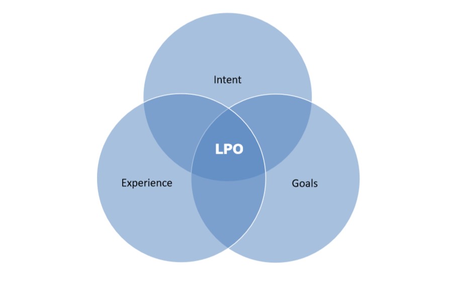
As Marty explains in the webinar, landing page optimisation involves three key areas which are indicated in the below illustration. It will help explain the Three Critical Questions every good landing page should answer, i.e.
- Am I in the right place?
- How do I feel about this page?
- What am I supposed to do here?
The Secret To Landing Page Optimisation
It’s is all about aligning user intent with how visitors experience your website or landing page and your company goals. When your landing pages are not converting, chances are these circles are out of balance. In most cases, the reason is that you might be focusing too much on your company goals and not user intent and customer experience.
A fully aligned landing page or website can make a significant difference but you have to put aside your goals for a second. You know what your customers should do so keep that in the back of your mind and put the visitor first. Think about this:
- Why are they coming to your landing page?
- What did you promise them?
- What are they looking for?
- Are you delivering on that promise?
- Do all of these elements work together?
1. Am I in the right place?
Your visitor should never guess what they have to do so don’t make them think. Visitor intent should always match expectations otherwise they will leave and go to your competitor’s site that is perhaps easier to use and follow. Here’s a US-based example of a landing page that does not live up to expectations:
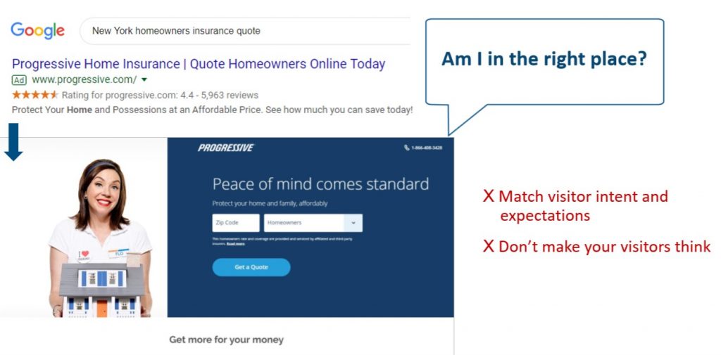
The Google search was for ‘New York homeowners insurance quote’ but as you can see on the landing page and the ad, there is no mention of New York. How do you know if this company offers insurance to homeowners in New York?
Similar issues are rife in online marketing, particularly when looking for a new ‘internet service provider in {your location}’. Often you have to enter your postcode only to get to the landing page or website where they don’t even cover your area. Here, visitor experience and expectation do not match intent.
Good Landing Page Examples
In this example, we use the same search criteria and you’ll see how a landing page should be designed. It has everything a visitor would have been looking for but most importantly, all the elements align (intent, experience and goals). Let’ take a look at how this website is better in every sense of the word.
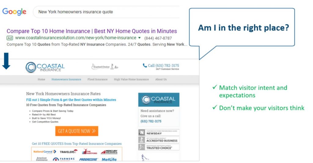
- Keywords from the search term appear in the ad and URL
- The landing page content contains information about ‘homeowners insurance quotes’ in ‘New York’
- It doesn’t make the visitor think and here their expectations match the intent
Marty and his team at SiteTuners helped the client with their landing page optimisation and the results were exemplary. This insurance company saw an 80% increase in conversion rates all because everything aligned perfectly.
2. How Do I Feel About This Site?
As you’d expect, one of the first things you need to do is create a good website or landing page with quality content. Remember, a well-executed design can seriously boost your credibility. Other criteria include social proof, transparency, security seals and available support, all of which builds trust. Having these elements in place will help your visitor feel good about your landing page.
Here’s what you shouldn’t do as illustrated in the example below:
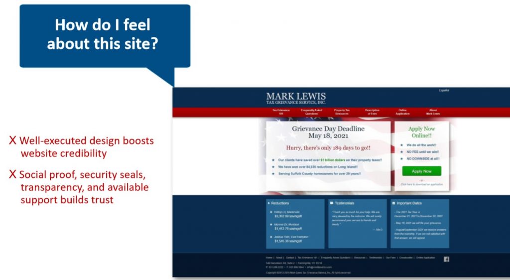
This is a tax grievance site where you can query the amount of tax you are paying and request an assessment. However, this process is not as simple in New York as it requires additional steps and information which is where this example comes into the equation.
This site is all about how you, the individual, should apply online with the tax deadline the primary headline. Not only is the design outdated but there are also no security seals or social proof that will help a visitor feel safe. In the next section is an example of a high-converting landing page from one of their competitors and you’ll quickly spot the difference.
Example Of A High-Converting Landing Page
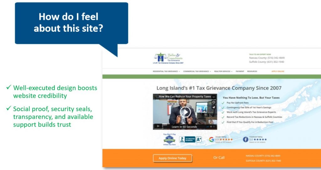
This web design is more modern and streamlined with easy-to-follow instructions and navigation. It also has loads of social proof and trust symbols with the Better Business Bureau, Google and Facebook ratings. Besides these, the most important trust symbol is a contact number (click-to-call). On a desktop, it’s the phone number in the top right and on mobile, it’s the phone icon.
3. What Am I Supposed To Do Here?
Most people respond better to visuals rather than simple text which is why quality design is so important. It comes down to the issue we mentioned before of not making your visitor have to think too much. The moment they are not drawn in by your design and become confused as to the next steps, you’ve lost their attention. To ensure your visitors like what they see and know what to do, remember the following:
- Create visuals to direct a visitor’s attention to a specific point or area of the page
- Use simple but informative calls-to-action in an organised and logical way
- Keep the most important information above the fold
- Use bullets or numbering to make your content scannable and easier to remember
- Where possible, put the important content into an F-shaped scanning pattern. This is the direction most people scan landing pages online
Example of What Not To Do
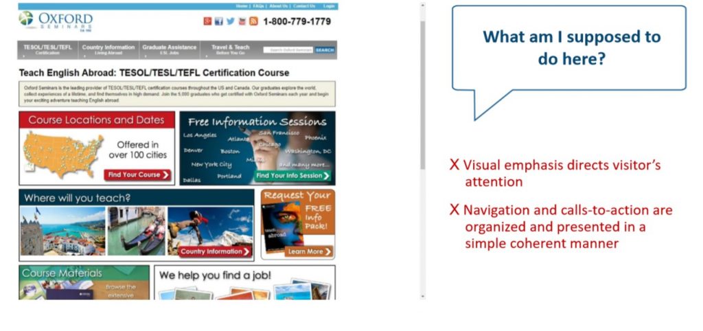
This website example of Oxford Seminars is a good way to show some major shortcomings. The first you’ll notice is how busy the page which simply won’t result in high conversions or any for that matter. It shouldn’t be a page that looks like a photo collage or a game of “Where’s Waldo”.
- Outdated design and confusing layout
- Too much information with no clear structure
- There’s no visual emphasis which leaves visitors wondering what to do next and where to go
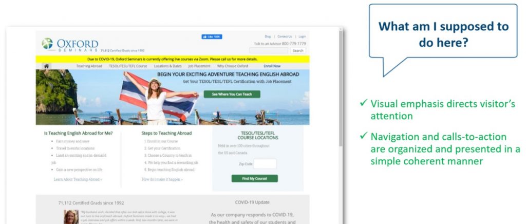
Good Example Of A Well-Designed Landing Page
After re-designing their website with the help of SiteTuners, it looks like a new company. Firstly, it’s more visually appealing and things are organised and easy-to-follow. Visual emphasis is in the right place which makes it simpler and more attractive for visitors. This resulted in a reduced bounce rate of 15%.
Landing Page Optimisation Best Practices
Part one in the blog series covered some design tips and in this section, we’ll briefly look at FOUR best practices when it comes to landing page optimisation. You can watch the video for a more detailed overview as Marty explains it superbly.
- Avoid visual distractions
- Display visual navigation on a homepage
- Reduce the number of form fields
- Place trust symbols in the header
As you’ve discovered from the examples, a good simple design, with visual navigation and clear CTAs help visitors easily find their way around your site. By making a few minor tweaks you can turn you’re landing page into a powerful lead generating machine.
Conclusion
When it comes to website content, the golden rule is to always focus on your visitor or customer. Your initial emphasis should be on market research trying to identify your target audience and their specific needs. Once you have the right personas, you can create better content suited to each one. From here, your landing page optimisation efforts should go smoother and a win-win for everyone.
Does your website answer the three critical questions? If you’re struggling to generate leads from your marketing campaigns, you probably need to reassess your landing page optimisation strategy. For expert advice, contact WSI eMarketing as we specialise in PPC, SEO, marketing automation and online reputation management among others.

Recent Posts
Popular Posts
About us and this blog
We are a digital marketing company with a focus on helping our customers achieve great results across several key areas.
Request a free quote
We offer professional SEO services that help websites increase their organic search score drastically in order to compete for the highest rankings even when it comes to highly competitive keywords.
